
When It Comes To Your Website, It’s NOT ABOUT YOU

When It Comes To Your Website, It’s NOT ABOUT YOU

It's about your audience.


When building a business website, the goal is simple: attract, engage, and convert visitors into customers. However, many websites fall short of achieving this goal because of avoidable mistakes. From cluttered pages, ignoring basic functionality and designing a site that appeals to them vs their target audience are all errors that can cost businesses credibility, leads, and revenue. 


Let’s explore the most common website mistakes business owners make, including too much text, poor targeting, and a few other critical missteps—and how to avoid them.


Mistake 1: Overloading the Site with Text

One of the most common website issues is an excess of text that overwhelms visitors. A text-heavy website can alienate users and obscure the core message.


  1. Over Explaining Products or Services:
    It’s tempting to detail every feature of your offerings, but most users are looking for quick, clear solutions.
  2. No Visual Breaks:
    Long paragraphs without formatting or visuals make it difficult for visitors to scan the content.
  3. Ignoring User Intent:
    Overloading with irrelevant information can cause potential customers to leave before finding what they need.


Solution:

  • Use concise, impactful language.
  • Break up text with visuals, bullet points, and clear headings.
  • Focus on the most critical information visitors need to know.


Mistake 2: Failing to Target the Right Audience

A website that doesn’t speak directly to its intended audience is like a billboard on a deserted road—it fails to connect or convert.


  1. Lack of Market Research:
    Without knowing your audience’s preferences, your site may miss the mark entirely.
  2. Generic Messaging:
    Broad, unfocused content often fails to resonate with anyone.
  3. Inconsistent Branding:
    If your site’s tone and visuals don’t align with your target audience’s expectations, it can create confusion.


Solution:

  • Develop buyer personas to understand your ideal customers.
  • Tailor messaging, visuals, and content to their needs and values.
  • Ensure branding (colors, fonts, tone) is consistent across your site.


Mistake 3: Slow Loading Speeds

A slow website is a surefire way to lose visitors. Research shows that 53% of users abandon a site if it takes more than three seconds to load.


Common Causes:

  • Large, unoptimized images.
  • Excessive plugins or poorly written code.
  • A low-quality hosting provider.

Impact:

  • High bounce rates.
  • Reduced search engine rankings.

Solution:

  • Compress images and use modern formats like WebP.
  • Minimize the use of unnecessary plugins.
  • Choose a reliable hosting provider.


Mistake 4: Neglecting Mobile Optimization

With over half of all web traffic coming from mobile devices, a website that isn’t mobile-friendly can alienate a huge portion of potential customers.


Common Issues:

  • Text that’s too small to read on smaller screens.
  • Buttons or links that are difficult to click.
  • Content that doesn’t resize properly.

Solution:

  • Use responsive design to ensure your site adapts to all screen sizes.
  • Test your site on various devices to ensure usability.
  • Prioritize mobile performance in your development process.


Mistake 5: Lack of Clear Calls to Action (CTAs)

A beautifully designed website is useless if visitors don’t know what to do next. Whether it’s signing up for a newsletter, making a purchase, or contacting your team, CTAs guide users toward their next step.


Common Mistakes:

  • Hiding CTAs or placing them in low-visibility areas.
  • Using vague, uninspiring language like "Click Here."
  • Failing to align CTAs with user intent.

Solution:

  • Place CTAs prominently on your site, especially above the fold.
  • Use action-oriented language, such as “Get Started,” “Download Now,” or “Learn More.”
  • Tailor CTAs to match the page content and visitor’s stage in the buyer’s journey.


Mistake 6: Ignoring Search Engine Optimization (SEO)

If your website isn’t optimized for search engines, your audience may never find you. Many business owners overlook SEO, leaving their site virtually invisible in search results.


Common SEO Missteps:

  • Not using keywords effectively in content and metadata.
  • Ignoring local SEO opportunities.
  • Failing to optimize images and site structure.

Solution:

  • Conduct keyword research and integrate terms naturally into your site.
  • Optimize meta titles, descriptions, and alt text for images.
  • Use tools like Google Analytics to track and refine your SEO efforts.


Mistake 7: Outdated or Unprofessional Design

First impressions matter, and an outdated or poorly designed website can make your business seem untrustworthy.


Common Design Issues:

  • Cluttered layouts with no clear hierarchy.
  • Inconsistent fonts and colors.
  • Low-quality images or graphics.

Solution:

  • Invest in a modern, professional design.
  • Keep layouts clean and intuitive, with plenty of white space.
  • Use high-quality visuals that reflect your brand’s professionalism.


Mistake 8: Overlooking Analytics and Testing

Many business owners launch their website and forget about it, missing valuable insights from user behavior.


Common Oversights:

  • Failing to track website performance with analytics tools.
  • Not testing for broken links or usability issues.
  • Ignoring user feedback.

Solution:

  • Set up tools like Google Analytics to monitor traffic and behavior.
  • Conduct regular usability tests to identify and fix issues.
  • Actively seek and implement feedback from users.


A great website is more than just a digital presence—it’s a vital tool for driving business growth. By avoiding these common mistakes, you can create a site that stands out, engages visitors, and converts them into loyal customers.


Take a moment to evaluate your site today. Addressing even one of these common issues can greatly enhance your user experience and boost your bottom line. 


And if you’re feeling stuck, don’t worry—that’s where we come in. Helping businesses like yours build effective, user-friendly websites is what we do best. Let’s work together to create a website that truly works for you!


August 14, 2026
Website accessibility has been a conversation for years, but recent changes to federal accessibility requirements are putting an even bigger spotlight on how websites work for people with disabilities. And if your website hasn’t been reviewed for accessibility recently, now is a good time to take another look. At River City Advertising, we have the tools to add accessibility-focused features that are easier for everyone to use. What Changed With ADA Website Accessibility? In 2024, the U.S. Department of Justice issued a new rule under Title II of the Americans with Disabilities Act establishing a specific technical accessibility standard for websites and mobile apps provided by state and local governments. That standard is WCAG 2.1 Level AA —a widely recognized set of Web Content Accessibility Guidelines designed to make digital content more accessible to people with visual, auditory, physical, cognitive and other disabilities. In 2026, the DOJ extended the deadlines for these public entities: April 26, 2027: State and local government entities with populations of 50,000 or more April 26, 2028: Smaller public entities and special district governments While these particular deadlines apply to state and local governments, the changes reinforce something that affects organizations of all kinds: website accessibility is becoming increasingly important. Businesses should also remember that accessibility obligations can vary depending on the type of organization, services provided and applicable federal, state and local laws. What Does an Accessible Website Actually Mean? Accessibility isn't simply adding a button to your website. An accessible website is designed so people with disabilities can navigate, understand and interact with its content—including visitors who use screen readers, keyboard navigation or other assistive technologies. Some of the elements that can affect accessibility include: Alternative text for meaningful images Appropriate color contrast between text and backgrounds Clear heading structures Keyboard-friendly navigation Properly labeled buttons, links and form fields Readable text and logical page layouts Accessible forms Captions or alternatives for multimedia content Correct website language settings Content that works effectively with screen readers Many of these features also happen to make a website easier to use for everyone , not only visitors with disabilities. How Our Platform Helps Us Build More Accessible Websites At River City Advertising accessibility isn't treated as an afterthought. Our platform includes built-in functionality that can help developers create more accessible websites, including support for alternative text, keyboard navigation and automatic website language definition. Our platform also integrates with accessibility solutions such as UserWay and AudioEye for businesses and organizations that want additional accessibility tools, monitoring and remediation capabilities. However, there is an important distinction: No website platform, plugin or accessibility widget can automatically guarantee that a website is 100% ADA compliant. Accessibility depends on the platform and how the website is designed, written, maintained and updated. For example, adding an accessibility tool doesn't fix a poorly structured page, unclear link text, an inaccessible third-party application or every issue created when new content is added. That is why accessibility should be viewed as an ongoing website-management practice rather than a one-time checkbox. Why Businesses Should Pay Attention Now Even if the newest Title II deadlines don't apply directly to your business, there are several reasons to make website accessibility a priority. Reach more people. An accessible website makes it easier for more potential customers to interact with your business online. Create a better user experience. Clear navigation, readable content, properly labeled forms and thoughtful page structure benefit everyone. Support your SEO efforts. Several accessibility best practices—such as descriptive image text, organized headings and well-structured content—can also help search engines better understand your website. Reduce unnecessary risk. Digital accessibility continues to be an important legal and regulatory issue. Proactively improving accessibility is much better than waiting until someone identifies a problem. Prepare your website for the future. Accessibility standards and expectations continue to evolve. Building accessibility into your website now makes it easier to adapt as requirements change. Accessibility Isn't "Set It and Forget It" This may be the most important takeaway. Your website can become less accessible over time as new pages, images, videos, forms, integrations and other content are added. That's why website accessibility should be part of ongoing website management. At River City Advertising, we can help businesses evaluate their current websites, identify accessibility concerns and determine what tools or updates may make sense. Is It Time for an Accessibility Check? If you're unsure how your current website measures up, we can help you take a closer look. Contact River City Advertising to talk about your website, accessibility options and how we can help make your online presence easier for more people to use.  This article is provided for general informational purposes and is not legal advice. ADA and digital accessibility requirements can vary depending on your organization and jurisdiction. Businesses with questions about their specific legal obligations should consult qualified legal counsel.
Silhouetted profile with glowing tech symbols and data overlays against a light background
By Jessica Ellett June 17, 2026
Artificial intelligence has changed the way businesses create content, brainstorm ideas, and tackle day-to-day marketing tasks.
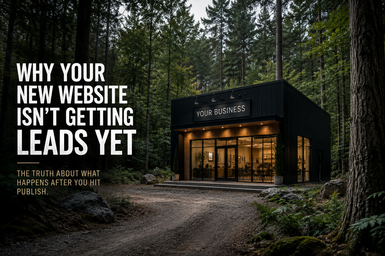
Website mockup: black cabin office in a forest with bold text, “Why your new website isn’t getting leads yet”
By Justin Ellett May 18, 2026
You launched a brand-new website.
An isometric map shows a small suburban neighborhood with several houses, roads, and a central roundabout with a pin.
By Jessica Ellett March 31, 2026
Tiny Roundabouts & Bad Branding: Why Ignoring the Basics Costs You More in the End
Musician playing acoustic guitar on a warmly lit stage with blurred band members in the background
By Jessica Ellett March 16, 2026
For musicians, a website isn’t just a place to store information. It’s a place to create an experience.
Two people sitting on a park bench, using a laptop and reading a tablet.
By Jessica Ellett February 26, 2026
(And the People Calling You Are Probably Women.)
Hands collaborating over colorful notes and sketches on a table during a planning meeting
By Jessica Ellett November 6, 2025
Branding Mistakes That Quietly Cost Small Businesses Thousands
Black-and-white speech icon with a face silhouette and sound waves in a circle
By Jessica Ellett August 22, 2025
The Tiny Words That Make a Big Difference in How You’re Heard
Billboard reading “TRENDS 2025” against a blue sky with clouds
By Jessica Ellett July 8, 2025
Branding Heat Check: What’s Sizzling This Summer
Two coworkers shaking hands in a bright office with colleagues smiling in the background
By Jessica Ellett March 6, 2025
Why Getting Back to People Matters